3 Story Gated Mews
Project - Battersea 3-story Gated Mews
Location - London
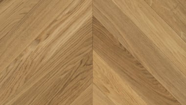
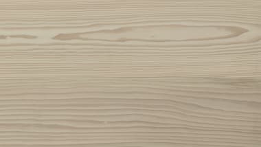
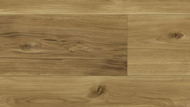
Product Used - HW2022 Alsace Chevron | HW2208 Alsace Midi
Designer - misch_MISCH studio
Developer - Berkeley Group
Builder - House Renovation London
Photographer - Veronica Rodriguez
Nestled within the established Battersea 3-story Gated Mews is a preexisting Mews House constructed in 1999 as part of a Gated development overseen by the Berkeley Group.
What did the project entail?
misch_MISCH studio were appointed as a lead Interior Architect & Interior Designer to design and curate a fully modernised property. This has entailed removing all the existing bathrooms, flooring and other surfaces, doors and windows, electrics including ceiling lighting throughout, existing kitchen and wardrobes; helical staircase metal and glass balustrade, to form an empty architectural shell. We forged a new luxury through detail-driven designs through the entire property across 3 floors, including a full FF&E procurement, Interior Project Management up to completion and Creative Direction.
This included: new floor throughout, refurbished stairs with new bespoke cladding and and new bespoke balustrade, new doors throughout with Buster & Punch ironmongery, new electric circuit for more user friendly use with dimmable electric sockets and switches by Buster & Punch. Four new bathrooms with new bespoke built joineries & stone rain vanities by Lusso Stone, marble tiling by Domus and sanitary ware supplied by a local branch of West One Bathrooms including a Powder Room that serves as a classy mud room with hand applied Clay works plaster. With bespoke floor-to-ceiling Italian made wardrobes, master and guest walk-in-wardrobe, a wardrobe to one of the kids’ bedrooms and hallway joinery.
All the worktops have a square edged thin minimalistic profile from white low vein marble supplied by a local MGLW warehouse and cut by local leading stone craftsman London Marble, with both whom we worked on a number of projects and can always rely on. New utility room with bespoke floor-to-ceiling joinery housing the client's existing Miele appliances. New minimal lighting throughout including newly created cove lighting detail to appear as if formed directly from the existing large vaulted ceiling to a reception. On the minimalist note, we furnished only where it serves purpose - keeping the open and uncluttered feel throughout allowing the client to move freely. The internal courtyard with outdoor seating and a new bespoke staircase with a sitting platform is planted for early in the spring 2024 as the final phase of the project.


What was the Design Brief?
The client was very clear about what they wanted and didn’t want from a very early start, which we found very helpful. Both husband and wife trusted each other with their roles and decision making in the project and were very aligned in their decisions and beliefs. They were both open to our creative and expert interpretations whilst trusting us fully in our curation as long as we kept these in mind. The brief was to fully modernize the outdated 3-story newly purchased property to fit their new life chapter.
Specific requirements resonant with the project were the client’s love for minimalism that is livable, functional, warm, grown up and welcoming. The client wanted the home to be airy and uncluttered, whilst being able to use their existing furniture they have loved for years like their B&B Italia dining table and chairs or their Ligne Roset sofa - which we fell in love with too.
They wanted to incorporate black and white elements and stay away from chrome, to use easy to clean and warm materials for the eyes and for the touch that are ‘baby-proof’ as we call it at misch_MISCH studio [no finger prints], no shiny surfaces that attract finger prints.


What was the design concept?
Despite these restrictions we found a lot of creative freedom in expressing our clients’ unique identities through every aspect of the design, ensuring each room and the home overall was an extension of their individuality as we told their story. Resulting in a calm and soul nourishing home to all family members while retaining their individuality.
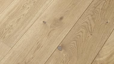
Our response to the client's brief and their requirements was to create a design concept that takes into consideration their likes for various styles and for a color and material palette that is soothing: from camel browns, off-whites that are softer than pure white, off-greys, charcoal black to gun metal and some peach fuzz [yes we are future trend-tellers quite often, but we kept this one secret]. This is why the Havwoods flooring and cladding on the newly refurbished stairs fitted perfectly within our proposed scheme and complemented bold features and bold black colors while balancing each other out. We loved the peachy and white soft undertones in the light oak finish that felt natural within our design scheme and the clients accepted the product choice easily.
It was evident from early on that Warm Minimalism with New Luxury style would be the most suitable in creating the luxurious yet relaxed and welcoming home this family wanted.
From the start we introduced the seamless flow of a narrow range of materials but with a wide range of hues and sheens that ensured the multi-dimensional effect on a much calmer scale than the usual New Maximalist approach our studio is known for. We find both styles immensely enjoyable as we enjoy maxing on material and layering textures in different light. Finding marble without much of a vein was a challenge on this project.
As we got to know our client’s design boundaries, despite this project being in Warm Minimalism we felt the need to introduce key features that would break the mold and the client's perception about where Minimalism can go whilst bringing the whole home into a seamless flow speaking in one unanimous language. The family are super happy they went with these and could not have imagined their new home without these features.


These are:
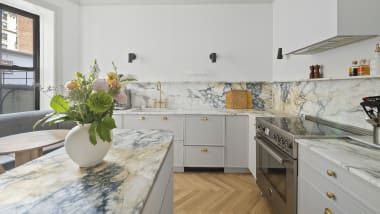
- Not exactly the smallest breakfast island with large radius corners, thin square profile marble top and reeded finish that has impactfully elevated the whole room. In fact this has become the favorite piece in the house for everyone - even we will miss it. There is nothing settled about this and it’s all about the ‘relaxed contrast’ of the harshness of kitchen units and angularity of the interior architecture of a building.
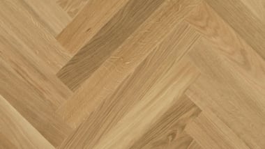
- Wooden floor around the kitchen area was a total no no from the client at first. We encouraged them to move to only one floor finish throughout the property excluding bathrooms and the utility room, where even the tiling was selected in complementary tones to the Havwoods flooring. Whilst taking on the classic chevron in the modern larger size to complement this Warm Minimalism and New Luxury interior scheme into confident and classy understated New Luxury home, we implemented soft layers thoughtful details throughout the property. Havwoods were very helpful in helping us to inform our clients of the maintenance and safety within kitchens and high traffic areas such as the entrance that were amongst the key decision making factors.
- Feature staircase: with its strong helical shape we wanted to retain the openness that exposes its bold shape. We proposed bespoke welded metal spindles, hand-sprayed on site in soft sheen black while sitting on contrasting off-white stringer and held by a soft sheen black bespoke handrail that continuously winds up from Lower Ground floor to a top Master floor from floor to floor in a singular piece. Contrasting gently against Havwoods minimalist cladding as it oozes from the floor.
- Mud/ Washroom with a curved vanity and two wall lights where the client planned to spend the least of budget that we discouraged them from an early start as this is the place that will be used by visiting guests. We proposed thoughtful details such as bespoke wall hung vanity with soft brown Daino Reale marble with super-high profile and contrasting handle-free off-white joinery and deck mounted gun-metal spouts. Mirrored with Peach Fuzz spray painted soft sheen bespoke built in joinery and contrasting mounted black minimalistic tube lighting opposite a round light above the vanity. This has created a beautifully harmonious yet luxurious space with contrasting tensions as it complements the sloped double height glazed ceiling. This proposal took some convincing but as with all other features, the clients are happy they were safely encouraged and reassured of these impactful changes to a scheme.
The whole property is tied in with new thin frame windows and full height-width sliding glazed panels with a refurbished arched entrance door - the only piece in the entire property that has a higher sheen. You will see, though this project is in Warm Minimalism/ New Luxury style we introduced textures, contrasting features, luxurious and softly bold elements, and tensions with layers of color to ensure the multi-dimensional aesthetic of the entire property as you walk through each room that seamlessly flow from one to another.
We aimed to source sustainably for this project with locally sourced materials and local craftsmen and businesses for a low environmental impact that is dear to us as well as to our clients.


Where there any specific problems or criteria to be considered?
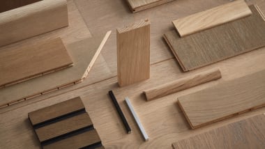
One of the requirements for the product selection was to be able to see the physical product in the showroom, which was very helpful for our clients to allow them to make a visual decision as seeing and touching actual samples, and visualizing them alongside other materials were always key in their decision making. This also helped us reassure our client why we believed Havwoods flooring was the ideal solution for the project and for the family.
With the assistance of Harry’s colleague we were able to point out the benefits of this product including the particular concerns about the maintenance.
What were the reasons for choosing the specific Havwoods product?
At first the client wanted to go with the lower range selected product but we encouraged them that for the large area that becomes a feature, to opt for the highest range and to up the budget as this would act in their favour as the project is finished and enjoyed.
The tint of the finish was very important as the client did want warmth that other products did not offer.
Havwoods offered a balance of: design, budget, lead time, quality and durability, finish tint, grain, large chevron pattern and the ease of the assembly. Further down the line Havwoods was also the perfect match for our staircase cladding which seamlessly completed the whole scheme with a luxurious feel.
The product offered a luxury within the budget and a classy appearance that became a signature to the whole project - complementing the bespoke designed feature breakfast island and the feature helical staircase.


